01 / Intro
Great Clips
Services
UI Design, Design System
Credits
Dragon Army
Date
2023
Live Site
greatclips.com
01 / Intro
UI Design, Design System
Dragon Army
2023
greatclips.com
02 / Brief
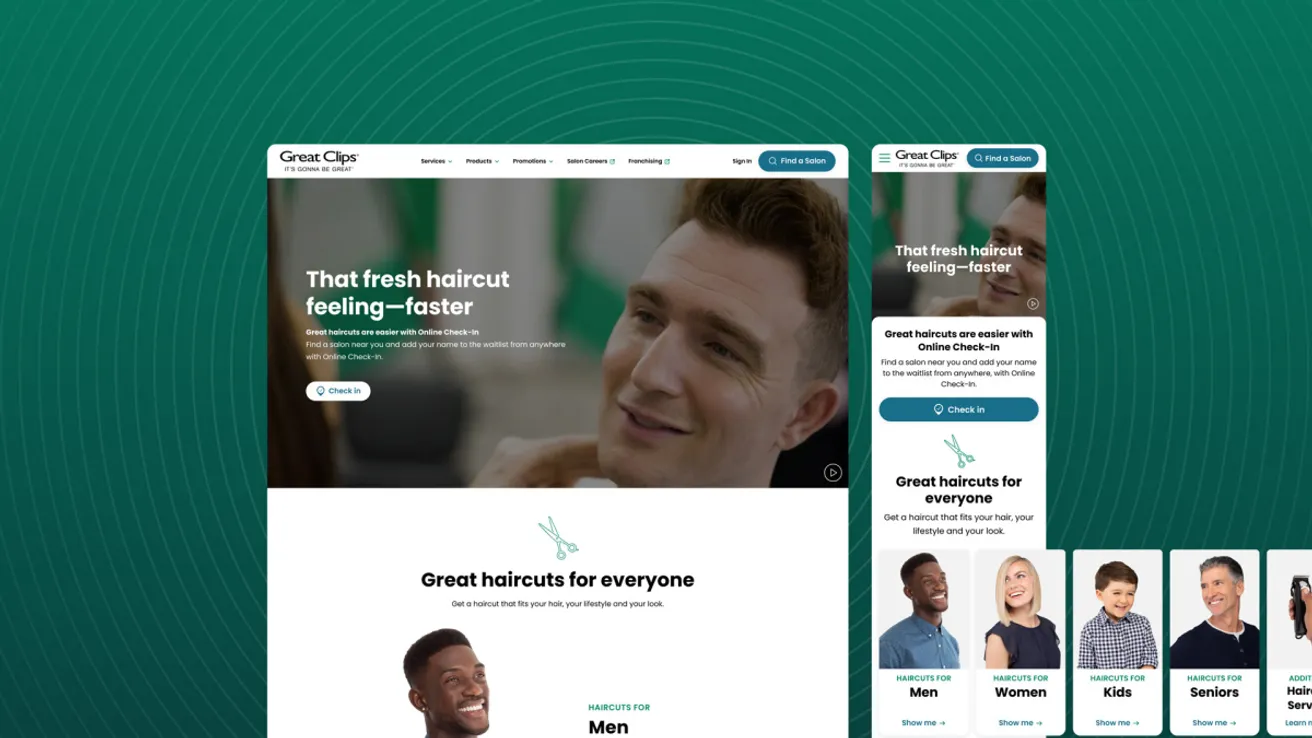
Great Clips, a renowned brand, has been dedicated to enhancing its digital presence to better serve its customers. Recently, the Great Clips team updated their mobile app, creating a delightful and elegant user experience. However, this update did not align with their website and other digital platforms.
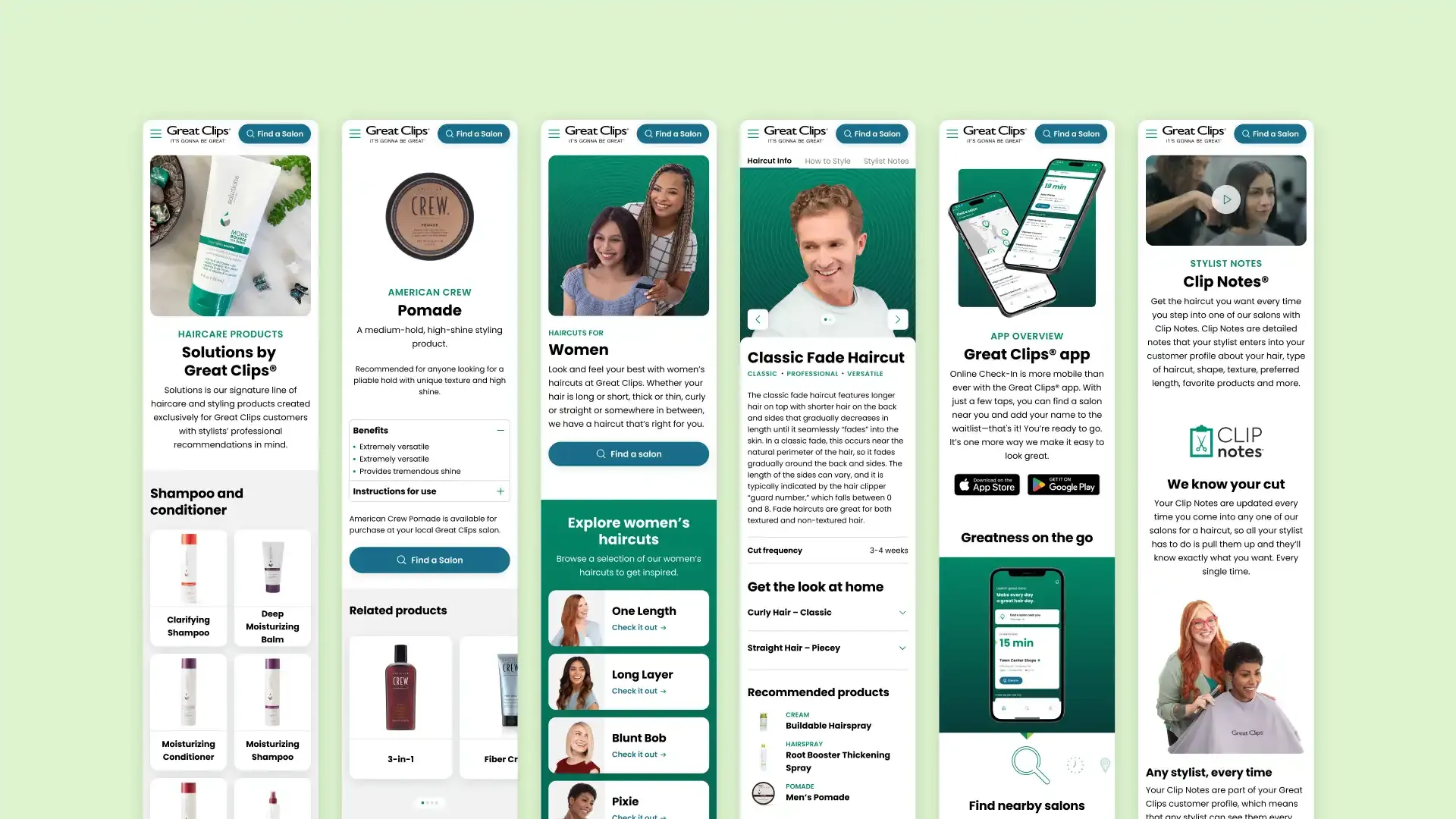
To fix this issue, I collaborated closely with both an internal team and their marketing department to modernize the Great Clips website. The newly refreshed website now offers a cohesive and user-friendly experience, making it easier for customers to navigate and find the information they need.
03 / Process

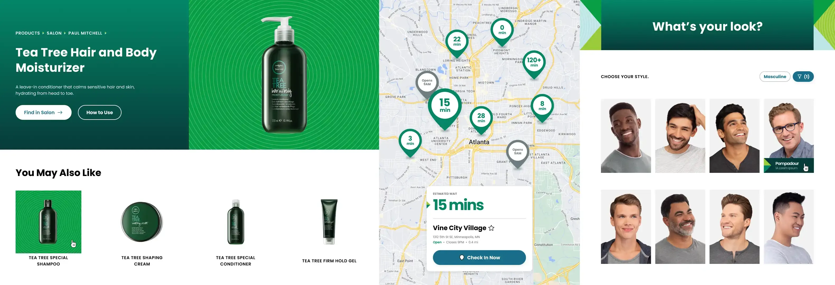
We began by creating “stylescapes” to visualize the website’s look and feel. We presented three options and collaborated with the client to select the one that best captured their brand essence and vision for the site.
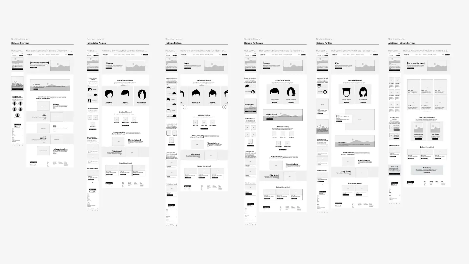
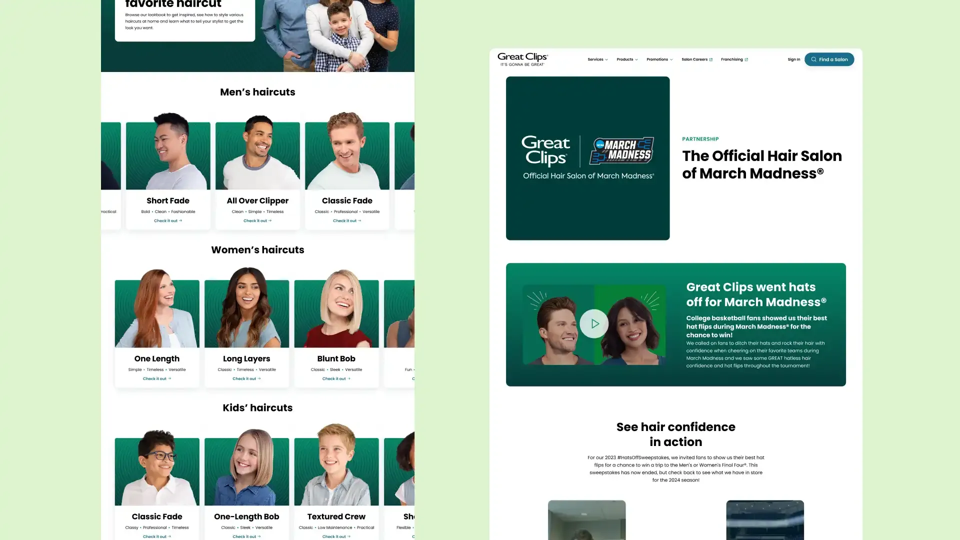
As we developed the styles, our team collaborated with the client to update their requirements and suggest ways to enhance their website. One feature we implemented was the Lookbook, which lets users browse different haircut styles and learn about the necessary products and maintenance that would apply to that hairstyle.
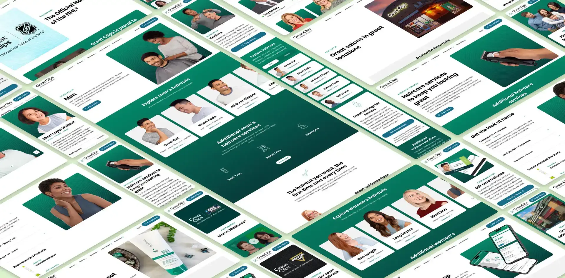
Once the client approved the wireframes, I began applying our stylescape work to the product. I designed components and built out the design system using the atomic design methodology. Starting with the basics—typography, grid, colors, and icons—I then moved on to global elements like navigation, buttons, image treatments, and cards. After receiving client approval, we implemented these elements across the website, beginning with the homepage. Using a waterfall approach, we successfully worked through all 122 screens, staying ahead of the initial timeline.
While the waterfall process led to some changes that impacted previously approved screens and pages, the scalable design system made global updates quick and efficient.
As the development team worked on the pages, I collaborated closely with them to ensure everything was implemented as expected. I provided code for the navigation and footer components, utilizing a flex-based approach that allowed them to scale seamlessly across all screen sizes.
Throughout the remaining development phase, I assisted with QA to ensure the website adhered to the design system, was fully responsive, and functioned as intended.
04 / Facts
Total Screens
122
Sprint Duration
3 Months
Tools Used
Figma, Photoshop, Jira
Year
2023
